Friday and Genter

By Beth Scanlon
on May 21, 2014
With 0 comments

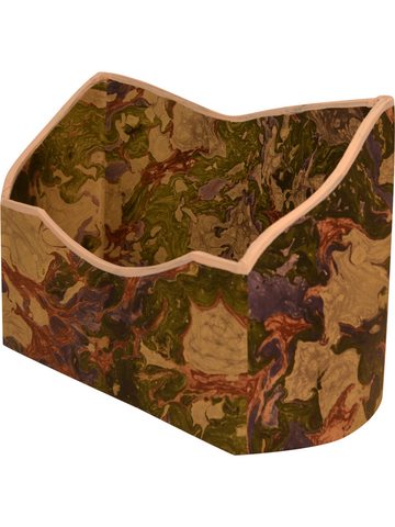
I had the great pleasure of working for Anne Genter and Suzanne Friday while living in Pittsburgh.  The gorgeous dining room pictured above is in Suzanne's home.  This is a detail from her portfolio www.fridayinteriordesign.com.  I made these branches with plaster and paint after seeing them in a small photograph of Cecil Beaton at home in Ashcombe.  Suzanne also commissioned me to paint the artwork for the pictured advertisement. The urns are glorious and the project was rewarding from start to finish.


Shelves

By Beth Scanlon
on May 08, 2014
With 0 comments

This is inventory presently on my studio shelf, a volume of The Selected Letters of Eugene Delacroix is on my library shelf.


About Delacroix's letter writing, I will give you a sample of the enormously varied closings:

Farewell, ever yours  *  Please accept my renewed thanks  *  Goodbye, my dear good fellow  *  Goodbye, a thousand embraces and write to me  * Farewell,farewell  *  I take my leave of you, thanking you once again for your letter and assuring you of my sincere affection  *  Remember me affectionately  *  I clasp your hand with true gratitude  *  All my sincerest thanks and friendly regards  *  I have only room left to tell you that I shall always love you.


I find him to be genuine, warm, and intelligent.  "For in letters," Delacroix wrote, "a man stands revealed."  


Working with Anne

By Beth Scanlon
on May 02, 2014
With 0 comments

The photograph directly above was taken by Jeffrey Hirsch for NYSD in Susan Gutfreud's home.  It was an inspiration for the painted shades and when I worked with Anne she had the perfect client for them.

Scalamandre

By Beth Scanlon
on April 25, 2014
With 0 comments

The wall in this painting is papered in Scalamandre's Pillement inspired pattern,  Petit Chinois.  I think the pom pom tape and the drapery tie backs are charming with the paper.  The curtain fabric is likely silk, lined and interlined, and it must be 2 and a half or three widths fullness. The colors and the details made painting it cheerful this week.

Could It Be Marmaduke Cradock?

By Beth Scanlon
on April 04, 2014
With 0 comments

I have nearly finished a large portrait of Suzanne Rheinstein's living room and these are some details. I like how the decalomania lamp echos the plantings outside the window. The embroidered cushion and the Italian chair are a color and pattern of which I would never tire. And, the oil painting was so much fun to translate.

I noticed a very similar painting in the home of another Southerner, Furlow Gatewood. Mr. Gatewood's painting also features a peacock, turkey, chickens, and a hovering dove.  It hangs in his Peacock House. I wondered if there was a story to these paintings.  A quick search led me to Marmaduke Cradock, 1660-1717. I read on the Tate website that his bird paintings reflect the increasing curiosity in the natural world and the drive to classify different species of his time. They are interesting and lovely, I will have to ask.


This Room

By Beth Scanlon
on March 18, 2014
With 0 comments

I painted this after a Pieter Estersohn photograph for Suzanne Rheinstein. When I see the photograph I am reminded of what Claude Monet said of purple,"I have finally discovered the color of the atmosphere."  My goal with this work was to leave more white space in the painting, around the chair legs and cushions. It is a style I found in Mark Hampton's watercolors.  I was working with a pretty color of gold mixed with purple to create a lovely cafe au lait. Alas lost in the work, and losing light in my studio as the evening advanced, the color slipped to gold.  I'm crazy about Suzanne's choice of the Jansen embroidery pattern on the curtains, it is just the sort of feature which can make a painting. 

Waterblog

By Beth Scanlon
on March 10, 2014
With 0 comments

You may remember the collaboration between Scalamandre and Mark Hampton. I thought the resulting postcards were beautiful and the two cards pictured below have been in my file for some time.  With the current interest in the watercolor app, I wondered if there might be a market for original work in the style of the late Mr. Hampton. The first picture is my work. To keep the spirit of Scanlon Apparati, and to employ a very traditional practice, I offer each painting in it's own folder. This makes a pretty presentation and allows the designer and client the ability to custom frame.  

The Scout Guide

By Beth Scanlon
on March 07, 2014
With 0 comments

Thank you Susie Matheson and Christy Ford of The Scout Guide for picturing the Haga Park Tent in your Taigan interview. The Scout Guide is a series of city reference books that highlights the best of local business. It is growing rapidly and for good reason, the guides are beautiful. Taigan's blog is called Fetch magazine and it is edited by Julia Reed. Julia Reed is publishing a new book with a gorgeous cover, One Man's Folly: The Exceptional Houses of Furlow Gatewood.

I could not resist pairing this with a photograph. It is me in the studio with our retriever, named Scout, poised to fetch. 

The New Pretty

By Beth Scanlon
on March 07, 2014
With 0 comments

I like the cover and the title of the April 2014 Veranda.  Although this picture reads a little gray, it is almost a companion piece to the magazine. Fresh colors and stems for spring.  I haven't used this sky blue before, but I will again soon.

Hydrangea

By Beth Scanlon
on March 02, 2014
With 0 comments

When a hydrangea is dried it looks like paper.  Maybe that is why this paper hydrangea is so lifelike. I added more florets after the first photograph was taken, but I like the picture well enough to include it here.

Italian Paper Collection

  • Baroque Letter holder Faux Apt Faience in brown/blue
    Baroque Letter holder Faux Apt Faience in brown/blue Baroque Letter holder Faux Apt Faience in brown/blue
  • Baroque Letter holder Faux Apt Faience in green/lavender
    Baroque Letter holder Faux Apt Faience in green/lavender Baroque Letter holder Faux Apt Faience in green/lavender
  • Cartonnage Boat Valet Tray in Italian Paper
    Cartonnage Boat Valet Tray in Italian Paper Cartonnage Boat Valet Tray in Italian Paper
  • Cremona Pencil Holder
    Cremona Pencil Holder
  • Edwardian Triptych Letter Holder in Florentine Metallic Gold Italian Paper
    Edwardian Triptych Letter Holder in Florentine Metallic Gold Italian Paper Edwardian Triptych Letter Holder in Florentine Metallic Gold Italian Paper
  • In-Box with Lid in Blue Tile Italian
    In-Box with Lid in Blue Tile Italian In-Box with Lid in Blue Tile Italian
  • In-Box with Lid in Fierenze Italian Paper
    In-Box with Lid in Fierenze Italian Paper In-Box with Lid in Fierenze Italian Paper
  • In-Box with Lid in Fiori Blue Italian Paper
    In-Box with Lid in Fiori Blue Italian Paper In-Box with Lid in Fiori Blue Italian Paper
  • In-Box with Lid in Giglio Italian Paper
    In-Box with Lid in Giglio Italian Paper In-Box with Lid in Giglio Italian Paper